B!atch Tequila
B!atch is a lifestyle brand that celebrates the flavour of luxury and the spirit of incredible women.
At the core of B!atch's philosophy is the commitment to building a strong, vibrant community of women. Through its diverse initiatives, the brand fosters an environment where women can connect, share their experiences, and support each other's growth and success. This sense of community is integral to B!atch's mission, as it provides a platform for voices that are often unheard and stories that are frequently untold.
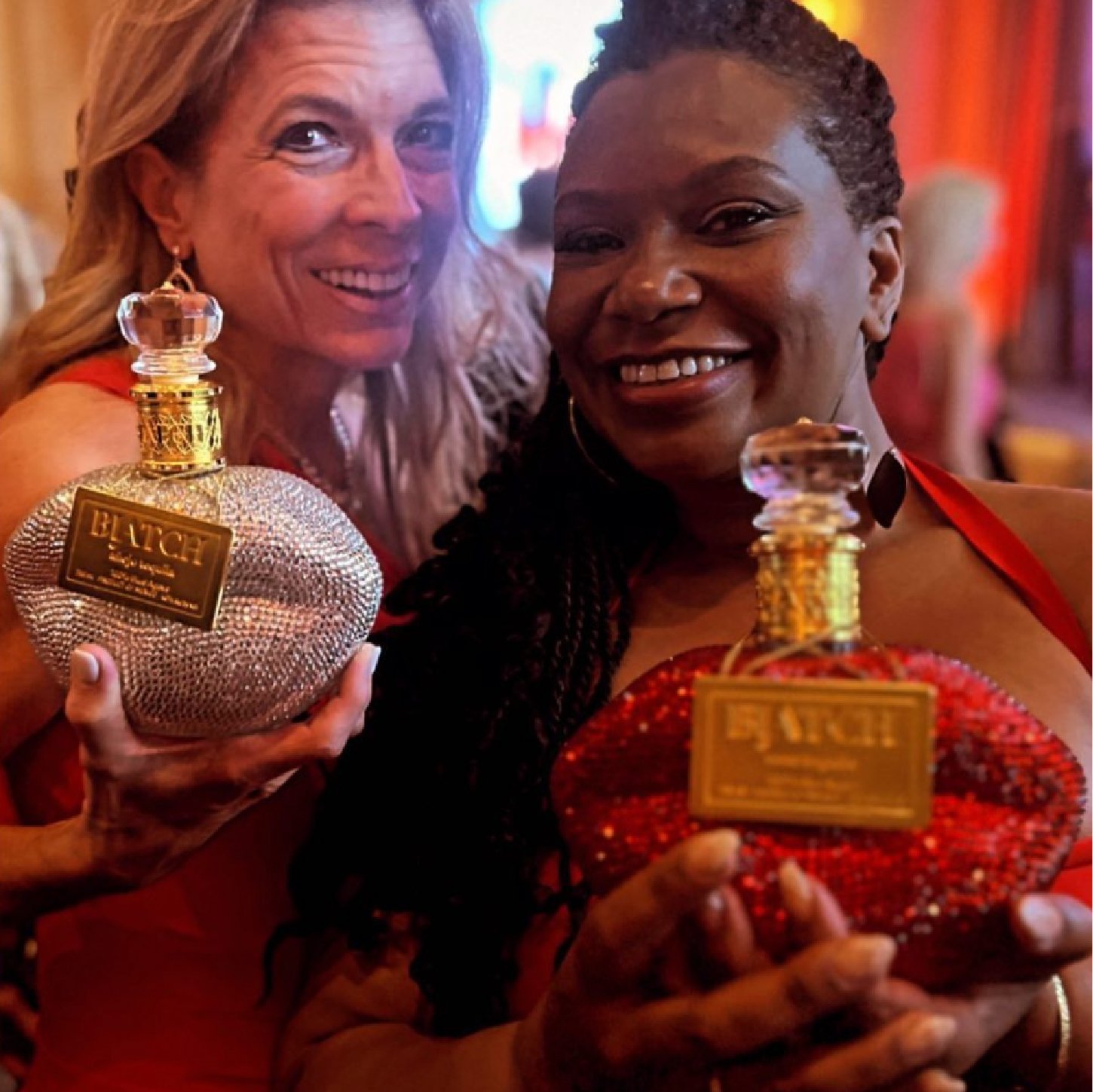
The inspiration for a bottle in the shape of lips is a deliberate nod to the fearless expression and bold conversations that are hallmarks of empowered women. Lips are universally symbolic of communication and individuality, two values deeply rooted in the B!atch ethos.
Choosing lips for the bottle design is also a celebration of femininity and the diverse ways women make their mark on the world. It's a shape that immediately conveys passion, allure, and the power of a woman's voice. In the context of spirits, which often facilitate gatherings and stories shared among friends, a lip-shaped bottle is both a conversation starter and a visual representation of the brand's commitment to fostering a strong, supportive community of women.


The packaging design of B!atch Tequila is a true testament to its bold and feminine spirit. Encrusted with shimmering crystals, the bottle exudes glamour and sophistication. No detail is too small for B!atch Tequila, and the closure is no exception. Resembling a large diamond, the closure serves as a luxurious finishing touch to the bottle’s design.
Packaging Design
Design Team: Pavla Chuykina, Galima Akhmetzyanova
3D Renders: Pavel Gubin
Awards: Pentawards 2023, Shortlist


