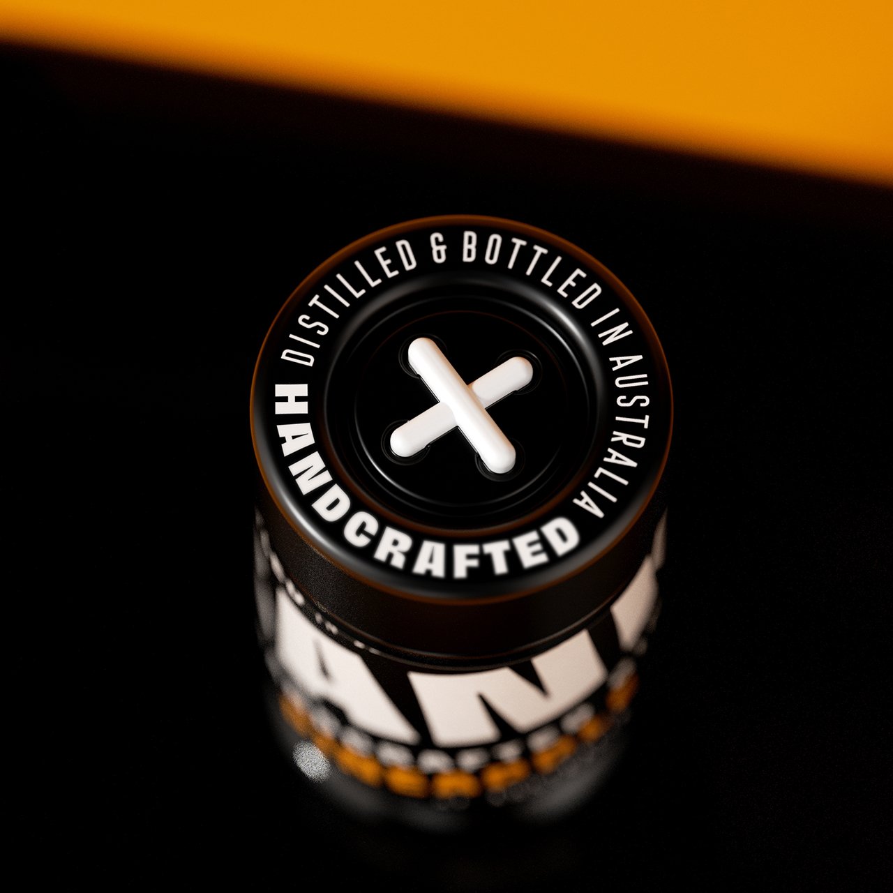
Franky Gin
Franky is short for 'Frankenstein,' which has been perceived as a monster for centuries. 'Frankenstein' is more of a unique mix. As today’s world moves at high speed, changing every single minute and continually opening new opportunities, there were so many things needed to be said and stitched together. Franky Gin became a manifesto of Diversity and Equality.
The bottles are designed with a deep indentation at the bottom, allowing them to interlock with the neck of another bottle. This feature enables the bottles to be stacked. Each label on Franky Gin features distinct parts of a face. When the bottles are stacked, these elements align to form a complete face, echoing the theme of assembling something greater from individual parts. This interactive element of the design encourages consumer engagement and offers a unique visual experience in retail environments.


Branding
Identity
Packaging Design
Naming
Design Team: Pavla Chuykina, Galima Akhmetzyanova
3D Renders: Pavel Gubin


